What is the image() function?
#When we declare a background-image, we use the url() function to tell the browser where it can find the image.
While very useful, url() has some limitations that can sometimes result in hacky solutions, so as part of the level 4 spec for CSS Image Values and Replaced Content, the working group has introduced the image() function.
While at first glance it is very similar to url(), it opens up some new doors as it can allow us to define:
- Image fragments. These allow us to define a specific part of the image that should be visible rather than the entire image (this is also being added to
url()but with a slight drawback which we’ll talk about). - The directionality of the image. This might sound strange but could prove very useful in some situations.
- A solid color to use as a fallback if the image fails to load, or even to define the background itself
withoutan image. On first glance, this sounds a little pointless, but it might be my favorite use case forimage().
The very basics of image()
#The image() function can accept three optional values:
- A tag for image directionality (either
ltrorrtl) - An image source
- A color
Because everything is optional, it can look a lot like url() at first:
.keeping-it-simple {
  background-image: image("images/my-image.webp");
}
Image fragments
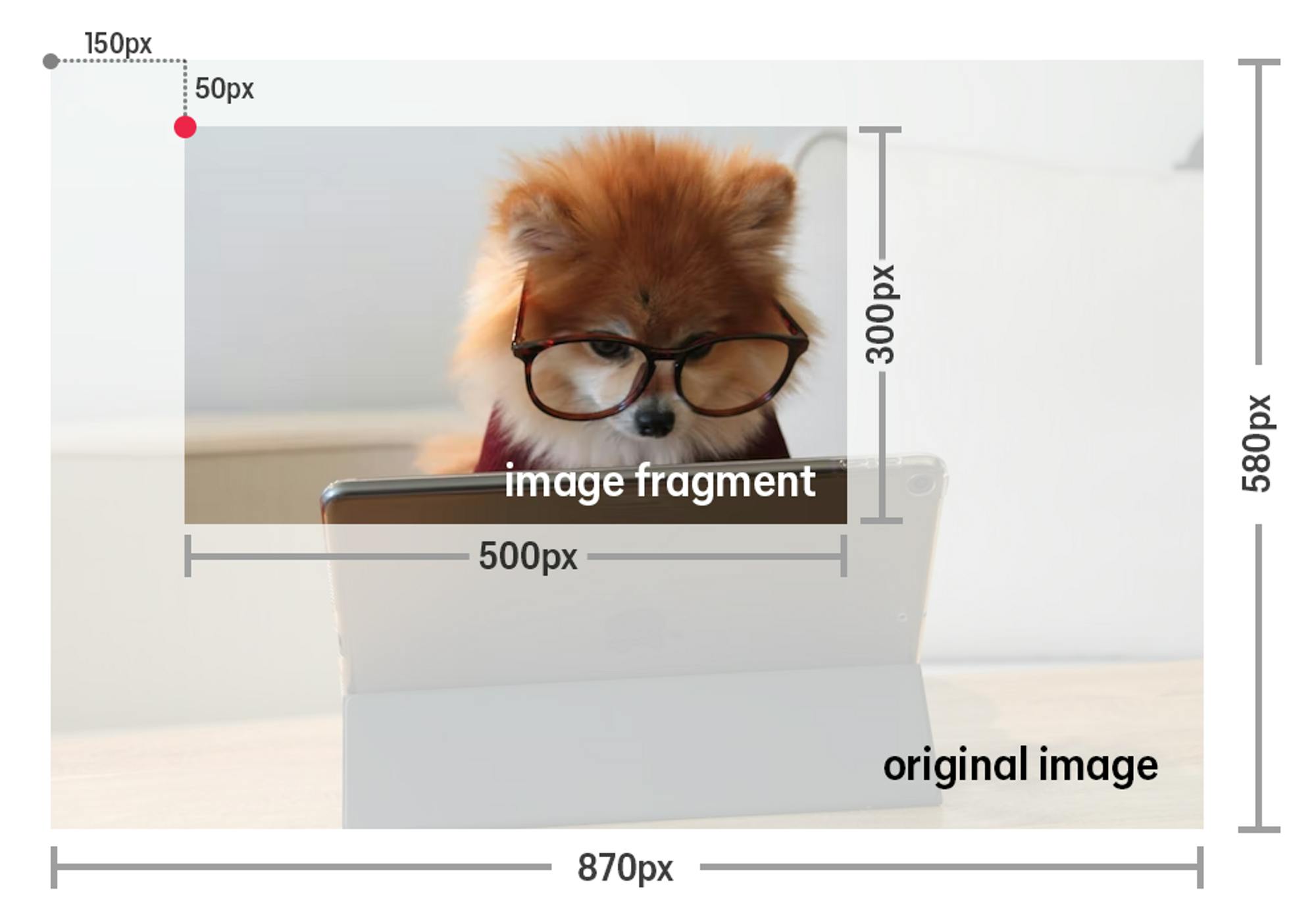
#When we provide the URL for the image, we can add a media fragment identifier to display only a portion of the image rather than the entire thing.
We do this by supplying an x and y coordinate, which are the starting point, followed by a width and height.
We do this by appending the information after the URL with a #xywh= followed by the values we want to use for the starting coordinates, width, and height.
.hero {
  background-image: image("images/my-image.jpg#xywh=150,50,500,300");
}
In the example above, we would start in the top-left corner, move 150 pixels across and 50 pixels down, and then select the region that would be 500px wide by 300px tall from that starting point.

Use cases for image fragments
#One thing that might come to mind is being able to use one image and crop it in different ways within a media query. However, this means you are loading in a larger image than is required, and you might be better served using the <picture> element, which allows for different sources based on the viewport size.
If you are using the same image multiple times within a page and need to crop it in different ways, image fragments would be a lot easier than working with background-size and background-position and would allow you to load in one single image rather than multiple different versions of it.
Another use case would be image sprites, where we can simplify how we have traditionally done them using background-position.
.icon-1 {
  background-image: image("images/icon-sprite.png#xywh=0,0,16,16");
}

.icon-2 {
  background-image: image("images/icon-sprite.png#xywh=16,0,16,16");
}

.icon-3 {
  background-image: image("images/icon-sprite.png#xywh=32,0,16,16");
}
Using pixels or percentage
#When we define the fragment, the default units used are pixels, but we can explicitly tell the browser to use percentages instead by including percent: before the coordinates.
.pixel-based-fragment-1 {
  background-image: image("images/my-image.jpg#xywh=20,30,500,300");
}

.pixel-based-fragment-2 {
  background-image: image("images/my-image.jpg#xywh=pixel:20,30,500,300");
}

.percentage-based-fragment {
  background-image: image("images/my-image.jpg#xywh=percent:10,10,70,80");
}
When we do this, all of the coordinates will be a percentage.
That means in the example above, the class .percentage-based-fragment would show 70% of the total width and 80% of the total height of the original image, starting 10% across and 10% down.
The url() function and image fragments
#Image fragments have also been added to the url() function.
If a browser doesn’t support image() it simply won’t load the image, whether or not there is a fragment.
When using an image fragment within a url(), if a browser doesn’t support image fragments, it will still load in the image provided in a url(), but the fragment will be ignored, resulting in the entire image loading in.
Depending on the situation—such as with image sprites—this could be problematic.
Instead, we could provide a fallback as a url() for browsers that do not support fragments.
.with-fallback-image {
  background-image: url("images/my-fallback.jpg");
  background-image: image("images/my-image.jpg#xywh=20,30,500,300");
}
Directionality
#With the rise of logical properties, it is now easier than ever to deal with different writing directions.
The idea of an image changing directions might seem a little strange, as most images you use shouldn’t be flipped when switching between a left-to-right or right-to-left language.
If we omit a direction tag, then the image is considered to have no directionality, and the writing direction will have no impact on the image.
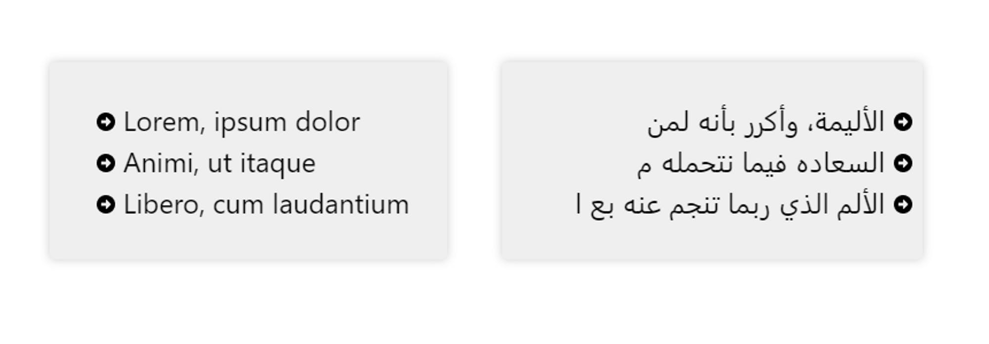
If you have images or icons that denote directionality, such as an arrow on a bullet list, this feature could be super handy!
Taking that arrow example, you might do something like this:
.arrow-list {
  list-style-image: url('arrow.png');
}
This would work fine until you switch the writing direction, which would result in this:

Using the image() function, we can add directionality to the image by indicating it before the URL with either ltr or rtl for left-to-right or right-to-left.
This defines the original direction of the image, telling the browser that if the writing direction changes from what we have defined, the image should follow that switch.
.arrow-list {
  list-style-image: image(ltr 'arrow.png');
}
Creating a fallback
#When we declare a background-image it is a good idea to provide a solid color fallback in case the image doesn’t load so that we can ensure any text that would be on top of the image is still readable.
Using image(), we can do this by simply providing a color along with our URL.
.with-fallback-color {
  background-image: image("images/my-image.jpg#xywh=20,30,500,300", #123456);
}
Being able to declare a fallback color is already very handy, but it also opens up another possibility that I’m very excited by.
Tinting an image
#A common complaint about background images is that there is no easy way to reduce their opacity.
Either we need to open up some editing software or use a pseudo-element as a layer between our background and the content.
This is because if we have a background-color and a background-image, the image is always on top of the color.
We can use a background-blend-mode to blend the two, but this can be hit-and-miss, and the effect can change drastically from one image to another.
One useful thing we can do with background-image is stack multiple images on top of one another, and because image() allows us to declare a solid color, that color can be part of that stack of images.
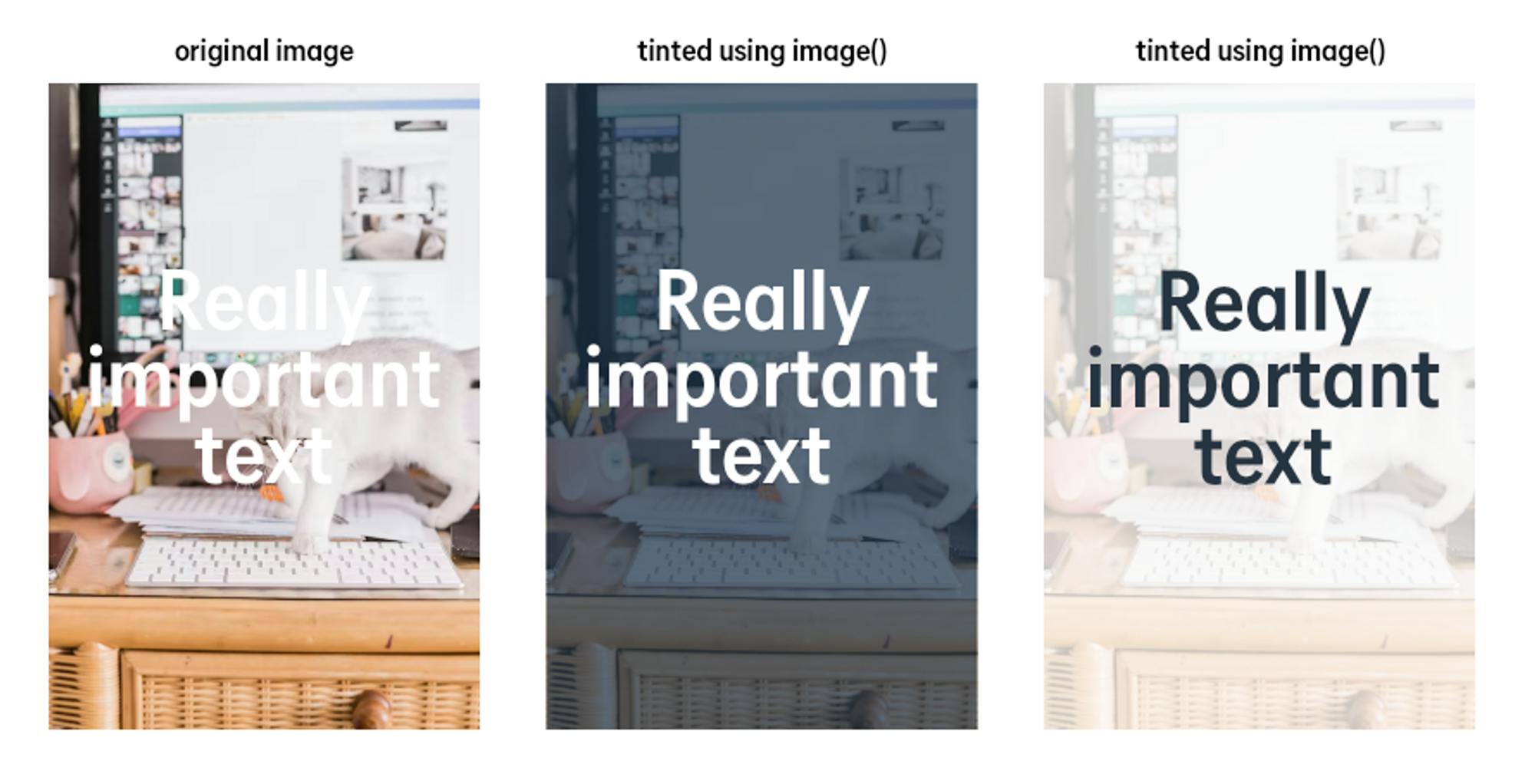
We can use this to tint an image by putting the top layer in our stack as a solid color with a reduced opacity.
.tinted-bg-image {
  background-image: image(hsl(210 47% 20% / .75)), url("images/my-image.jpg");
}
With this, we can tint an image quickly with any color we want, including the same color we’ve used as the background to simply make the image look like it has a lower opacity on it.
.tinted-bg-image {
  background-image: image(hsl(210 47% 20% / .75)), url("images/my-image.jpg");
}

.fake-low-opacity-bg {
	background-image: image(hsl(0 0% 100% / .8)), url("images/my-image.jpg");
}
Wrap up
#CSS seems to be evolving at a faster pace than ever, with a few big features, like :has() and container queries getting a lot of attention (with good reason, they’re amazing).
While I’m looking forward to a lot of the big new things as well, things like image() often go under the radar but end up being those little things that improve how CSS works at its core.
By being able to easily bring in image fragments instead of having to fight with background-position and background-size, providing fallback colors, and enabling layers of images and colors, those of us who author CSS are gaining a lot of small quality-of-life things that, over time, we’re sure to simply take for granted.
Additional resources
#Kevin selected CHU Sainte-Justine Foundation for an honorary donation of $50 which has been matched by

Support CHU Sainte-Justine in its pursuit of excellence and its commitment to providing children and mothers with one of the highest levels of health care in the world, now and in the future.

