
Images on the web are hard. In this article, we're going to focus on the options for the display of responsive images.
There are a few different ways to add images to your page depending on what you care about in regards to what part of the image is displayed, the quality, and the performance. This is a high-touch overview that really only scratches the surface of these methods. Be sure to check the additional resources for more assistance researching the best method for your use case.
Basic img element
#If you have optimized your image and aren't doing anything unusual with its display and aren't concerned about serving higher density images for retina screens, just a simple img will do.
<img src="image.png" width="600" height="400" />I've intentionally added the width and height attributes here to give the browser information about the image's intrinsic aspect ratio. Evergreen browsers now will pick up on the computed aspect ratio and prop open the space necessary for the image while waiting for it to download which can reduce cumulative layout shift. Watch Jen Simmons explain more about how it works.
img with srcset
#If you want to begin to have some performance gains, you can save out your image in multiple sizes. Then, define them within the srcset attribute on a single img along with the value of their intrinsic (actual) width or the pixel density you prefer to be used. The browser will select the optimum choice given conditions like the viewport size, resolution, user preferences, and bandwidth.
<img
  alt=""
  src="image-small.jpg"
  srcset="image-large.jpg 1600w,
        image-medium.jpg 768w,
        image-small.jpg 320w"
  width="1600"
  height="800"
/>

<img
  alt=""
  src="image-1x.jpg"
  srcset="image-3x.jpg 3x,
        image-2x.jpg 2x,
        image-1x.jpg 1x"
  width="1600"
  height="800"
/>
We're still including width and height to give the browser the aspect ratio hint. It's ok that the browser might choose a different image size because the assumption is a single image is resized which means the aspect ratio is the same throughout, regardless of ultimate rendered size.
img with srcset and sizes
#With only srcset to go off of, the browser still has to wait for CSS to help determine the size to render. You can provide an additional hint by also adding the sizes attribute which relates to approximately how large the image will render within your layout.
The sizes attribute will be ignored if srcset is not provided. This is because the matching size will inform which image within srcset to use. The other condition is that srcset must be using widths and not density for this relationship to work.
When using sizes, the format is [media condition] [display width], [media condition] [display width], [display width] where display width is the intended width in your layout. The last value in the list must not have the media condition.
The browser will use the first matching media condition in the list based on device size and then select the exact srcset size if there's a match or the next largest size if there's no exact match.
<img
  alt=""
  src="image-small.jpg"
  srcset="image-large.jpg 1600w,
        image-medium.jpg 768w,
        image-small.jpg 320w"
  sizes="(min-width: 120ch) 33vw, 100vw"
  width="1600"
  height="800"
/>
In that example, I'm letting the browser know that on a larger viewport I expect my image to take up roughly a third of the available space because it will be in a 3-column grid. Below that point, I expect it to take up essentially full width so we don't have to be more specific than 100vw. This still leaves it up to the browser to choose exactly which image to serve to best fit the layout expectations I have provided as well as its other conditions mentioned previously.
Art directing with picture
#If you would like more control over which image is used and the flexibility for varying aspect ratios (aka "art directing" the image selected), then look to the picture element.
This involves a series of source elements that use the media attribute to define the media condition at which an image should be displayed. It's essentially like defining media query breakpoints directly on the image with the advantage of the browser knowing exactly which image to choose and start downloading even when CSS isn't available yet.
<picture>
  <source media="(min-width: 600px)" srcset="image-landscape.jpg">
  <source srcset="image-portrait.jpg">
  <img src="image-landscape.jpg" alt="">
</picture>
This method removes browser heuristics beyond viewport size from the equation and puts the responsibility back on you to provide the best image for the user. If your image maintains a consistent aspect ratio across various sizes, choose the img with srcset option or keep reading for a combination option.
Here's a video showing the art direction idea in action. Above 480px viewports, a landscape image is shown where a woman is laughing while sitting in a meeting at a Mac laptop with another woman who is partially visible turned to her with a hand raised mid-storytelling. Below that viewport size, the image is cropped in to feature the laughing woman.
Offering modern image formats
#If your primary goal is to score some performance wins, then the picture element is again what you need. It allows you to list images using modern image formats like WebP, AVIF, and JPEG XL for the browser to select from, where the first supported type by DOM order of your source elements will be used.
<picture>
    <source srcset="image.jxl" type="image/jxl">
    <source srcset="image.avif" type="image/avif">
    <source srcset="image.webp" type="image/webp">
    <source srcset="image.jpg" type="image/jpeg">
    <img src="image.jpg" alt="" width="600" height="400">
</picture>
We're once again providing width and height attributes for this method to ask the browser to hold open space for the image to load into.
Prioritizing performance
#To get the best of modern image formats while also allowing the browser to determine which image is best for the user's current context, we can use the srcset attribute on sources within picture. Users of browsers with support for WebP or other modern formats will enjoy a significant performance boost compared to only providing standard jpeg images within a single img srcset.
<picture>
<source
type="image/webp"
srcset="wreath-w_200.webp 200w,
wreath-w_660.webp 660w,
wreath-w_960.webp 960w">
<source
type="image/jpeg"
srcset="wreath-w_200.jpg 200w,
wreath-w_660.jpg 660w,
wreath-w_960.jpg 960w">
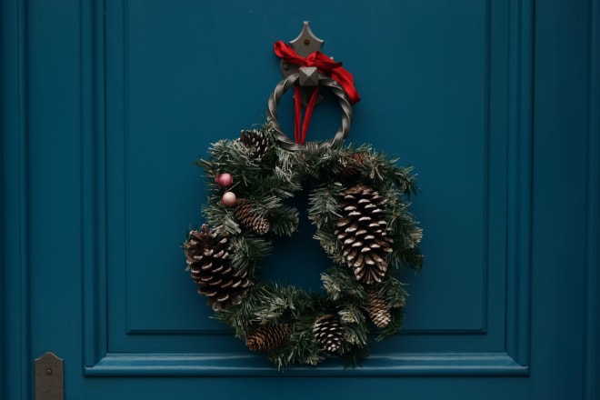
<img
src="wreath-w_660.jpg"
alt="A holiday wreath made of evergreens and pinecones hangs from a round metal doorknocker attached to a teal door."
width="960"
height="640">
</picture>In the demo, resize your viewport and then hover over the <img> tag in dev tools to see which image type and size was selected by the browser. Since we haven't used the media attribute, if your browser has downloaded a larger size it may not switch to the smaller size for a resize event since there is no performance gain. A refresh may trigger a change in the size selected for smaller viewports.
Also, note that the chosen size depends on not just viewport CSS pixels but also pixel density which may cause a larger than expected image to be selected. As in, the 660w image doesn't mean that image will be selected at 660px viewports.
Demo of srcset on source in picture
/* ensure the image resizes with its container
as well as keeping its aspect ratio */
img {
  max-width: 100%;
  height: auto;
}
Lorem ipsum dolor sit, amet consectetur adipisicing elit. Suscipit, reprehenderit doloremque. Tempore, esse dolorum? Quasi sunt sed temporibus perferendis, officia voluptatum sit fuga doloremque repellat, deleniti quod officiis esse mollitia.
Lorem ipsum dolor sit amet, consectetur adipisicing elit. Et exercitationem sint quis ullam quae, vitae libero doloremque dolores reprehenderit, fugit totam quisquam. Eum nostrum incidunt quas expedita nobis suscipit et!
You can take this method one step further since the source elements also support the sizes attribute. Note that you can only select a combo of either media and srcset, or srcset and sizes.
Boosting CSS background images with image-set
#There are certainly reasons why adding an inline image may not be feasible due to using a CMS or other systems without full control over the HTML. In the cases where you at least have CSS control, you can still start to get some benefits similar to srcset by using the CSS function image-set.
Rather than supply widths, the available option is to mark a resolution such as 1x and 2x. The browser will choose the best match including assessing the resolution as a proxy to assume a lower resolution will be more efficient for low bandwidth.
There is also a type value for defining modern image formats but it doesn't have sufficient support yet. However, browsers that support image-set() also support webp format so we can use webp in image-set() as well as a fallback of a regular background-image with a jpg.
For the current best support, we need to include the -webkit prefixed version as well:
.image-set {
  background-repeat: no-repeat;
  background-size: cover;
  background-image: url(wreath-w_660.jpg);
  background-image: -webkit-image-set(
    url(wreath-w_660.webp) 1x,
    url(wreath-w_960.webp) 2x
  );
  background-image: image-set(
    url(wreath-w_660.webp) 1x,
    url(wreath-w_960.webp) 2x
  );
}
This will behave differently than srcset since we can only give a hint at the resolution. But being able to draw out the more modern image format (even if a bit hacky right now) can still be worthwhile savings.
Styling picture as a background image
#Thanks to modern CSS, we can mix up the best of all the techniques to enable using picture with modern formats and srcset and sizes as a background. The other benefit we'll get is being able to retain alt descriptions which are lost as a side effect of actual CSS background-image.
Here's the HTML setup for this effect:
<div class="background-picture">
  <div class="background-picture__content">
     <p>Yay background picture!</h3>
  </div>
  <picture>
    <source type="image/webp" srcset="wreath-w_200.webp 200w, wreath-w_660.webp 660w, wreath-w_960.webp 960w">
    <source type="image/jpeg" srcset="wreath-w_200.jpg 200w, wreath-w_660.jpg 660w, wreath-w_960.jpg 960w">
    <img src="wreath-w_660.jpg" alt="A holiday wreath made of evergreens and pinecones hangs from a round metal doorknocker attached to a teal door." width="960" height="640">
  </picture>
</div>
To accomplish placing the text over the picture, we'll use CSS grid and a trick we first learned for the Day 6 holiday card generator for stacking elements.
Additionally, we've added one of my favorite CSS properties, object-fit, which makes the img behave as the container for its own contents. In other words, we gain the behavior of background-size but on a regular inline image.
You can even sprinkle in some art direction by using the companion property object-position which you can experiment with using my web app Object-Fit Focal Point.
Using CSS grid to stack content over the picture element
.background-picture {
  display: grid;
  /* create a single named grid area */
  grid-template-areas: "bp";
}

.background-picture > * {
  /* assign all direct children to the single grid area */
  grid-area: bp;
}

.background-picture__content {
  align-self: center;
  /* bring above picture when picture is last in DOM order */
  z-index: 1;
  color: #fff;
  text-align: center;
  font-size: clamp(1.35rem, 5vw, 1.75rem);
  font-weight: bold;
  padding: 5vh 1rem;
}

.background-picture :is(img, picture) {
  display: block;
}

.background-picture img {
  object-fit: cover;
  width: 100%;
  height: 100%;
  /* decrease brightness to improve text contrast */
  filter: brightness(0.65) saturate(1.25);
}
Yay background picture!
The demo also includes a succinct bonus modern CSS technique to improve text contrast over the image by reducing its brightness with a filter. We also bumped up the saturation to prevent completely losing the image's vibrancy. You could take this a step further and manage the brightness and saturate values with custom properties.
Aligning the content over the background picture
#To change from a centered alignment, you can place the content using the -self alignment properties available for CSS grid.
- Horizontally along the X-axis with
justify-self - Vertically along the Y-axis with
align-self(current style, set tocenter) - Set both axes at once with
place-self, ex.place-self: endwould put the content in the bottom right corner
Additional resources on image display and performance
#Understanding the elements we've reviewed, when to use them, and how to construct the attribute values is a complicated venture. Here are some additional recommended resources to help guide you to a scenario that works best for you.
First, I highly encourage you to review the MDN docs on each element:
Additionally, MDN has an excellent guide to responsive images that provides more demos of the things we touched on in this article.
Two tools to help prepare images:
- Responsive Image Breakpoints Generator from Cloudinary
- Squoosh app to convert between image types and adjust optimization
Still confused on when to use which type? Read these resources to help you understand... well, the bigger picture 😉
- Chris Coyier dropping knowledge and advice in 2014/15 that still holds up (that's the nice thing about HTML!)
- And more recently, Chris created a guide to responsive image syntax
- Eric Portis wrote this absolutely stunning article (coincidentally also in 2014) that is exceptional at explaining the srcset and sizes attributes
- More recently, Addy Osmani covered a lot about images as well as the relationship to Core Web Vitals (and he wrote an entire book dedicated to Image Optimization which you can find at the end of that article)
- The HTML spec includes guidance on a whole series of responsive image scenarios with example code
- Learn about responsive images and the picture element in the Responsive Design module from web.dev