
Imagine CSS Flexbox without the ability to use the flex property. Imagine CSS Grid without an ability to use repeat() for its templates, or an ability to configure grid-column and grid-row for specific elements. Without these essential features, these layout methods will not make much sense.
In a few years, after anchor positioning will become available in all browsers, we will look back at it and think: “How could we use it without anchors?” — that’s what I can say now, after experimenting with today’s anchor positioning prototypes and thinking about its specs.
The Disclaimer
#The first thing that needs to be said before discussing anchor positioning is — its current status.
Today, we cannot use anchor positioning in any regard. It is not ready.
The specification is evolving and improving; it is not done yet. While the first Working Draft was published in June, since then, there have been developments (see the Area-based Positioning section), which resulted in many additions to the current Editor’s Draft. Furthermore, there are close to 50 open issues, and it is uncertain what the specification will include when it will be ready.
That said, even today, there is a lot to play with!
You might want to open the examples you will see in the latest Chrome Canary with the “experimental web platform features” feature flag turned on so you can play with them yourself!
In this post, I won’t provide a “tutorial” on how to use anchor positioning. It is a large specification, and as it is not finalized, any tutorial will soon be outdated. If you’d want to read something besides the specification, I recommend the introductory article by Jhey Tompson. However, many of its details are outdated, like the change from anchor-scroll to anchor-default and several other aspects.
My goal today is to talk about what anchor positioning brings to the table, not to get lost in the particularities of the current implementation. I will not include many demos and examples of code in this post but will link to a list of experiments for you to explore in the end.
The Concepts
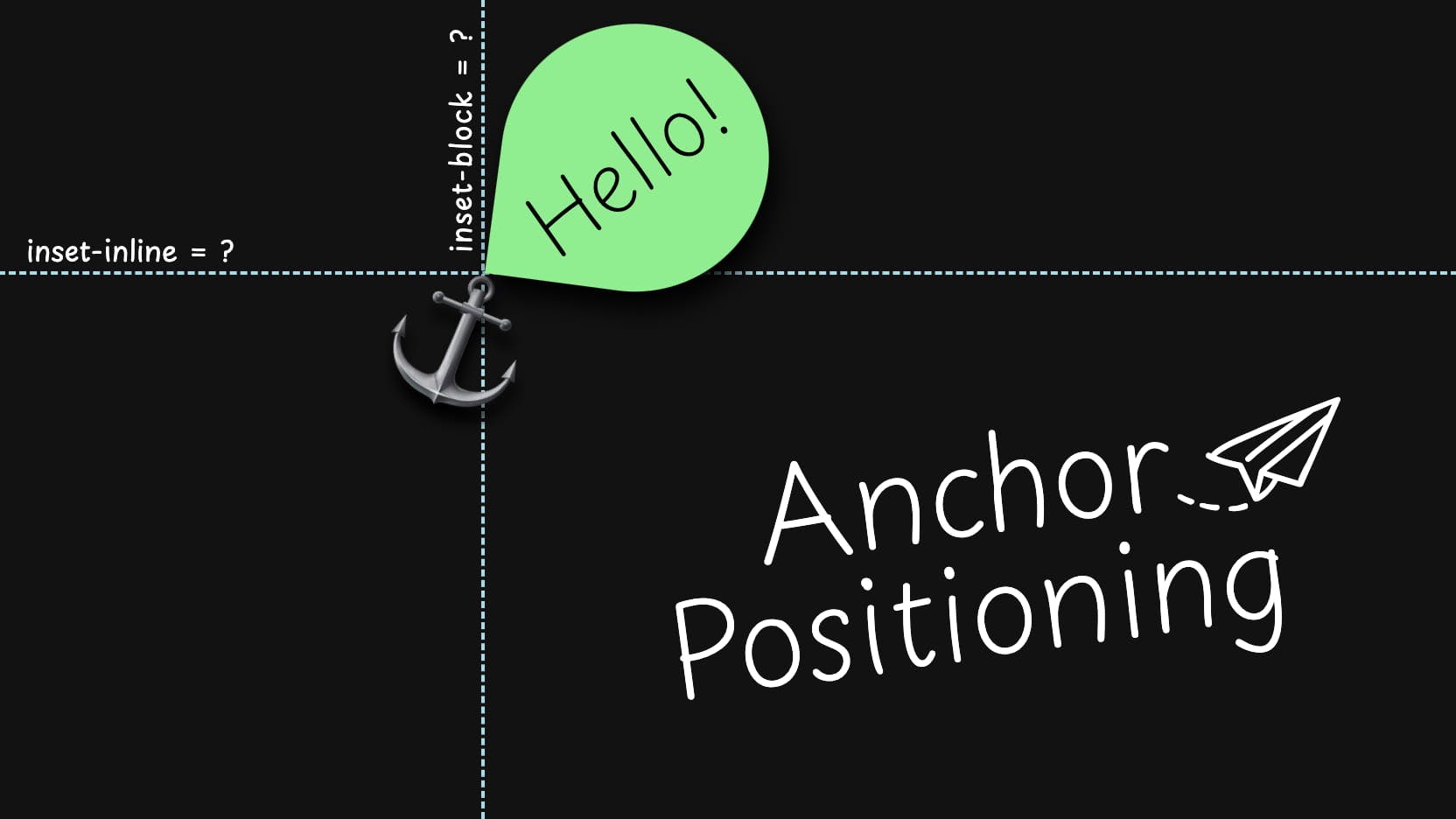
#In a general sense, anchor positioning is an addition to the existing absolute and fixed positioning (I’ll use “absolute” for both in the future to simplify things). It augments them by providing the superpower of knowing the positions and dimensions of other elements.
By itself, absolute positioning is absolute: you give it coordinates that are based on its positioning context (closest positioned ancestor or its initial containing block). That’s one of the two things our element knows about. The other is a “hypothetical box” — the initial position of the element if an inset property was not set, which might be a powerful way to handle absolute positioning but a fragile one.
And that’s it. Every so often, this is enough, but for many cases where we want an element to be visually attached to something, these limitations result in either us adding “magic” numbers or a lot of JavaScript.
Anchor positioning helps us by providing the information we need — and sometimes more.
Connecting Elements
#Anchor positioning does this by allowing us to explicitly connect an absolutely-positioned element to another element.
We do this in two steps in CSS:
- We give our anchor element the
anchor-nameproperty, which can contain one or more dashed identifiers, for example,anchor-name: --tooltip-context. - At the same time, we use this name on our absolutely-positioned element, mentioning it in the
anchor-defaultproperty, or inside theanchor()oranchor-size()functions.
When we do this, we connect our anchored element with its anchor, providing the coordinates and dimensions to be used as the base for positioning. That means our elements now do not live in isolation — they are connected, and a change in the size or position of one would result in the corresponding change in another.
In the below example, we can see how when we click on the button, the popover appears attached to it.
We’re not limited by connecting one element to one another. We can have a many-to-many relationship: multiple elements can connect to one anchor, and one element can use the information from multiple anchors, including inside calculations!
The demo above, for example, uses multiple anchors to position the arrow of a popover. You might notice that the popover itself is centered relative to the button, but the arrow has two attachment points: the popover itself and a snowflake inside the button.
Speaking of centering behavior, this is the most complex part of this demo. The code for it might look unappealing:
[popover] {
    inset-inline: calc(
      anchor(50%) -
      min(
        abs(0% - anchor(50%)),
        abs(100% - anchor(50%))
      )
    );
    margin-inline: auto;
}
Try wrapping your head around how this is calculated! This code is an adapted version of what was in the specs initially, but thankfully, we will have better ways of handling this in the works.
Area-based Positioning
#This summer, Elika J. Etemad and Jen Simmons from Apple, with the help of Miriam Suzanne, provided their alternative exploration of anchor positioning. You can read their original exploration and go through the slides they showed at the CSSWG face-to-face meeting.
Many things were proposed in the exploration, but the first thing that found its place in the revised specifications is the inset-area property — the idea of positioning things using a grid-like syntax.
As I demonstrated in the above example, we had to use overcomplicated calculations to center things properly. In the future, we will have an anchor-center value for self-alignment properties, but even then, we will have to rely on specifying the inset properties, which might be cumbersome.
The way inset-area would help with this is by allowing us to tell the anchored element to be positioned in a specific area of a 3×3 grid, which is formed around its positioning context and its anchor.
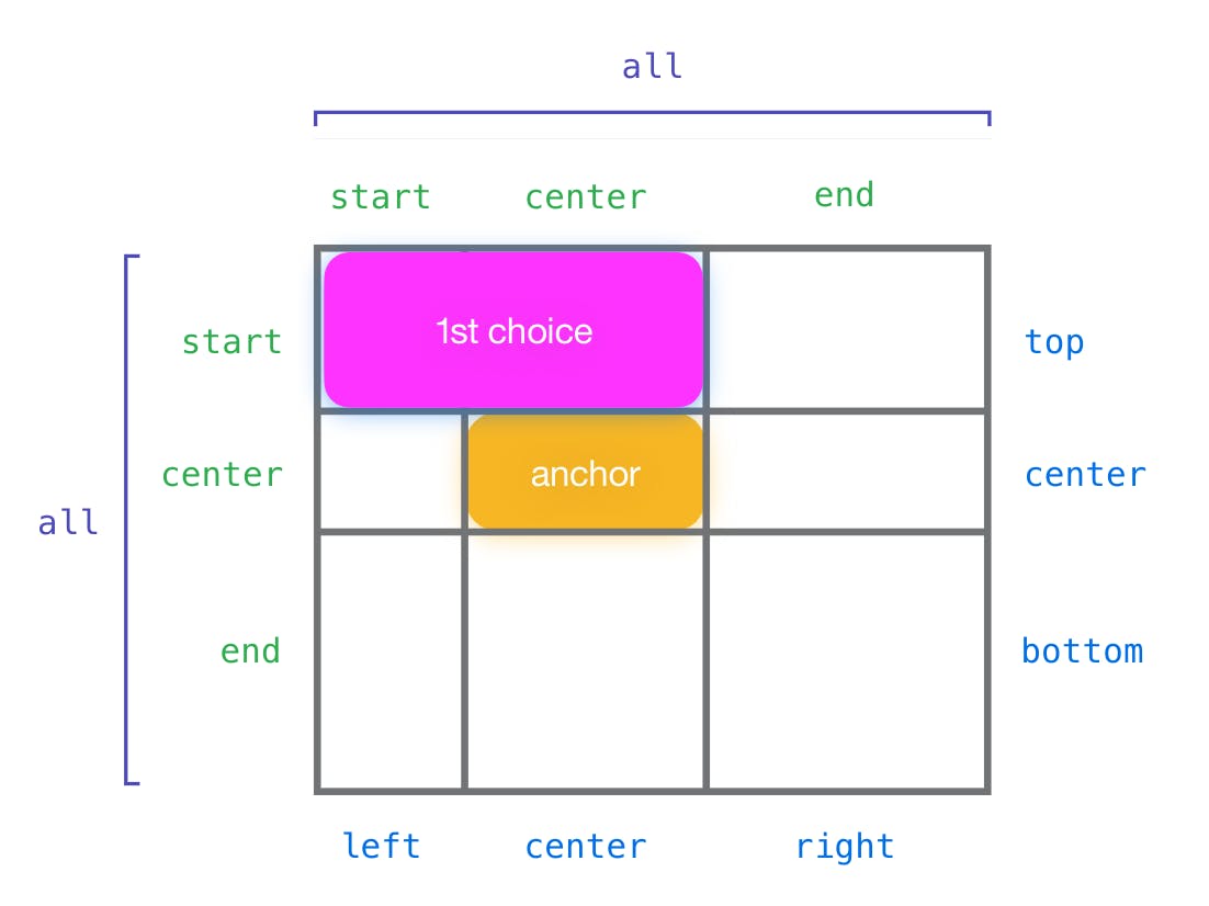
This is intended to provide a simple way to handle the most common cases for popovers and tooltips and will come with several built-in mechanisms for how the alignment will be handled.
I did file a CSSWG issue suggesting that we could use another anchor as a way to define our “containing block” that is used for inset-area.
While I was writing this article, the Chromium team started working on the inset-area prototype, and right now, we can play with it in Chrome Canary.
However, not all the moving pieces are in place that could help us see how useful this method will be. One of inset-area’s prominent features is how it will work with self-alignment properties, and this interaction is not yet in the prototype.
A few months back, after Apple presented their ideas, I created a prototype using existing anchor positioning in Chrome Canary. It used overly complicated CSS based on cyclic toggles as an attempt to test this syntax alongside the self-alignment and the potential ::tether pseudo-element.
It does not do everything right and might differ from what we have in Chrome Canary for inset-area. Nevertheless, I got enough insights from it, and I invite you to play with it and make your own observations! (Don’t look into the source — it is messy. I warned you!)
Position Fallbacks
#Another big aspect of anchor positioning is how it will handle how our anchored elements behave when they go beyond their scrollports.
There are multiple ways to achieve this in the current Canary implementation, but the specification is in motion, and it is certain that things will change, so I won’t describe the way it works now.
The idea that will stay: we will have a way to define how things will look when there is no space for an element, like flipping the popover to a different place.
In this screen recording of the demo in action, the popover changes its position when there is not enough space. The way the inline inset is set up also allows it to shrink to remain centered when located at the edge of the screen.
This is a video from a demo I did show before, where I used the current implementation and some hacks to achieve the desired behavior. Hopefully, the final specification allows us to do things without hacks!
Accessibility Considerations
#Apart from the anchor positioning not being ready for production in any way, one thing is worth mentioning: anchor positioning is used for connecting things with each other.
When using the popover attribute, the connection would be established, however, with an anchor attribute by itself, and when done in CSS via anchor-name, this connection is purely visual.
That means that while it is possible to connect elements that are located in different places on the page, anchor positioning could lead to the content not being accessible: visually, the content would be located together, but for keyboard navigation or any assistive technologies the pieces will be disjointed.
Again, the specs and its prototype implementation are in motion, and nothing is certain yet. We need to explore what anchor positioning could mean for accessibility in the future and participate in the discussions about that.
For example, I created an issue in CSSWG, where I proposed to automatically adjust the elements' logical (tab and reading) order when they’re connected via anchor positioning. It would be great if this could be handled from the get-go, and if you have anything to add — add your voice!
Additional Links and Experiments
#There were many aspects of anchor positioning that I did not cover in this post: anchor-size() (which I wish could be used for non-sizing properties), how to take the scroll into account, and other aspects of the features I covered or mentioned (for example, the nuances of how fixed positioning works when anchored). This is a complex spec!
In closing, I will list several articles and demos I recommend you check out if you are keen to learn more and see various use cases where anchor positioning can help. There are plenty of things we could do with it!
- “Tether elements to each other with CSS anchor positioning” — the already mentioned article by Jhey Tompson (many demos in this one!)
- My first article about anchor positioning: “Future CSS: Anchor Positioning” — contains many use cases outside the more common tooltips and popovers.
- My second, recent article: “The Shrinkwrap Problem: Possible Future Solutions” — about how one aspect of anchor positioning can help partially solve one of the oldest CSS problems.
- “Positioning anchored popovers” by Hidde de Vries — an article exploring different ways we can anchor things when using the Popover API, including anchor positioning.
- “Building a no-JS radial menu with CSS trigonometry, popover, and anchor positioning” — an article by Una Kravets in which she builds a radial menu by using Popover API and anchor positioning.
- “Nuclear Anchored Sidenotes” by Eric Meyer — an article exploring one of the more interesting use cases for anchor positioning.
If you’re curious how things evolved, you can look at all the explainers that were done:
- The most recent CSS Anchor Positioning Explainer by Xiaocheng Hu.
- An outdated CSS Anchored Positioning explainer by the Microsoft Edge team.
- “Call for web dev feedback: anchored positioning use cases + requirements” by Melanie Richards, in which she asks for dev feedback regarding the above proposal. A linked issue with the gathered feedback and use cases is also a very nice collection of things to think about in the context of anchor positioning.
- The initial exploration by Ian Kilpatrick and Tab Atkins-Bittner.
Roman selected QueerJS for an honorary donation of $50

QueerJS is a meetup series where everyone is encouraged to attend and support the speakers and the idea. If you're queer and want to speak, this meetup is for you! It exists to give you a voice and to make a safe space where everyone is welcome.