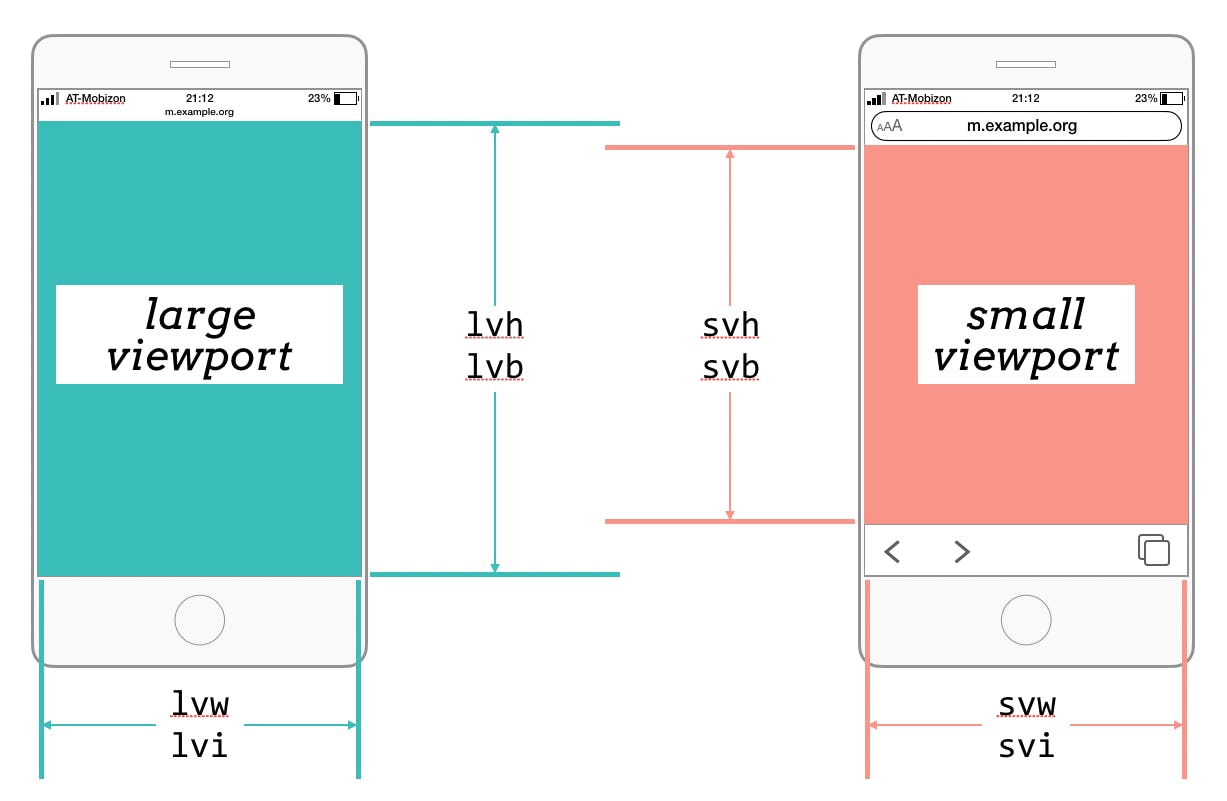
Once upon a time, web designers worried about browser window sizes—was the site supposed to be 640x480, 800x600, 1024x768? Even, dare we hope, 1280x960? And we fretted over whether a scrollbar would show or not, because that might throw off the horizontal layout space by a few pixels.
But then came Responsive Web Design, where we freed ourselves from those pixel plateaus and plunged headlong into the world of infinite diversity in infinite device displays. Once we were setting breakpoints and writing styles for whole strata of screen sizes at a time, our past preoccupations with a single scrollbar seemed silly.
There was a serpent in the Garden of E-mail, though. If you’ve used a mobile web browser in the past decade or so, you know they have a tendency to slide the URL bar and navigation buttons in from the top and bottom of the viewport when needed, and away when not. It’s a nice way to balance the desire for maximum reading space and access to browser chrome. But it raises the question: what defines the viewport? Is it the display space the browser UI hidden? The space between them when they appear? Both? Neither?
This matters because of viewport units like vh (viewport height) or vb (viewport block). If you set an image to be 100vh tall, trying to fill out the height of the viewport, will it actually fill the whole display? Will it shrink a bit to fit between the browser bars when they appear, or will it be overlapped? Should it instead be the minimum available height when the browser UI is visible, thus leaving it shorter than the display when the chrome is gone?
What if you want access to all those behaviors?
Enter the large, small, and dynamic viewports.

Large Viewport
#The large viewport is the viewport without any dynamic browser interface showing. On a mobile device, that would generally be the entire display surface, so setting an element to be 100lvh and 100lvw means it will be the same size as the device display.
A good use case for the large viewport is an illustration or “cover page” at the beginning of an article, sized to cover some or all of the entire viewport, where it’s okay if some parts are overlapped by the browser interface. A three-quarter-screen page might get CSS something like this:
article > header {
  width: 100lvw;
  height: 75lvh;
  background-image: url(cover-illo.jpg);
  background-size: cover;
}
So, if you plan to use the large viewport units, you should probably make sure your coding font makes clear the difference between 1 (one) and l (lowercase L), or else you might think you’ve specified 1,001 vw or 751 vh.
Small Viewport
#Anyway, the small viewport is the viewport with all the dynamic browser interface showing. Therefore, setting an element to be 100svh and 100svw means it will be exactly sized so that it will fit inside all the dynamic browser interfaces.
A good use case for the small viewport would be sizing a dialog so that no part of it can ever be overlapped by the browser interface, which is important for dialogs that have “X to dismiss” or similar. So you might style such a thing like this:
.warning {
  width: 40em;
  height: auto;
  max-width: 100svh;
  max-height: 100svh;
}
Dynamic Viewport
#If you want something to resize itself as the browser interface elements appear and disappear, you size with regard to the dynamic viewport. An element 100dvh and 100dvw will be exactly the same size as whatever part of the viewport is visible between browser interface elements. If there are none, the dynamic viewport is the same size as the large viewport. If all the browser interface is visible, the dynamic viewport is equal to the small viewport.
Keep in mind that as browser interface elements appear and disappear, the dynamic viewport will change from moment to moment, which means the exact length of the dvh and dvw units will change from moment to moment. This, in turn, means anything sized using those units will change, sort of like an interface-linked animation.
Picture it: a user starts to scroll a page on a mobile device, causing the URL bar and navigation bar to slide away. Anything sized using dynamic viewport units will resize even as the page is scrolling and the viewport is changing. This could be a significant performance hit, and even if not, the visual effect could be unsettling, potentially triggering users with vestibular disorders or epilepsy.
Using New Viewport Units
#Although these may seem very mobile- or at least handheld-centric, these units may become more handy for desktop and embedded contexts over time. Desktop browsers may become more like their mobile counterparts in terms of setting dynamic UI elements, and embedded-display browsers on things like home appliances or auto dashboard displays (which one could think of as mobile devices, in their own way) could very well use dynamic UI conventions.
Given all that, it’s definitely worth getting comfortable with these new viewports and their units. And here they are, spread out in a holiday table for you.
| Viewport | Large | Small | Dynamic |
|---|---|---|---|
| height | lvh | svh | dvh |
| block axis | lvb | svb | dvb |
| width | lvw | svw | dvw |
| inline axis | lvi | svi | dvi |
| minimum axis | lvmin | svmin | dvmin |
| maximum axis | lvmax | svmax | dvmax |
You can use these new viewport units today as a progressive enhancement by also including the stable unit in the corresponding direction, example:
.cover-dynamic-viewport {
  width: 100vw;
  width: 100dvi;
  height: 100vh;
  height: 100dvb;
}
Eric selected Rebecca’s Gift for an honorary donation of $50 which has been matched by

The money raised by Rebecca’s Fund will be added to the St. Baldrick’s efforts to fund promising research in the prevention of tumor reemergence.

