
The HTML element <dialog> has had a long history, first landing in Chrome in 2014! While iterations have had issues largely pertaining to accessibility, it has gained cross-browser stability in 2022.
Before we get into a demo and review implementation features, it's important to understand the difference between the two types: modal and non-modal.
Modal dialogs
#Modal dialogs are user interface elements that become the "top layer" above the rest of the DOM and require interaction that interrupts a user's flow. They have a fixed (non-moveable) position and cover the underlying page with a typically semi-transparent overlay which is the pseudo-element ::backdrop.
When a modal dialog is open, the content behind the page should be rendered inert - in other words, it should have interactivity removed, appearing static. The inert behavior creates a "focus trap" in the modal, meaning a keyboard user can enter the modal and not be able to have focus exit to the page behind until the modal is closed. While an attribute for inert is gaining browser support, a benefit of modal usage of the dialog element is automatic inert behavior. This again is tied to use of the showModal() method.
Another expectation of modal dialogs by keyboard users is the ability to close them using the Esc key, which the <dialog> element provides when launched using the showModal() method.
Non-modal dialogs
#Non-modal dialogs refer to typically anchored overlays that do not block the page. When open, a user still has access to interact with the page content. They should not be used if the action requires user input or interaction.
Examples include the "Compose" window for an email application, a newsletter sign-up nudge on a blog, a find and replace handler, an onboarding tutorial pointer, or any other sort of sub-window interface. You may choose to enable the non-modal dialog to be repositioned by the user.
The <dialog> element can be used as a non-modal dialog when launched with the show() method. A close action must be provided and non-modal dialogs require user interaction to close them.
Dialog demo
#Let's create a modal dialog for confirming whether a user would like to eat a penguin cookie off of a virtual cookie tray!
First, let's start off by designing the markup and styles for our tray of penguin cookies.
We'll use a list that contains our cookie image within buttons. The list semantics will help indicate to users of assistive technology like screen readers how many cookies are left on the tray. And <button> is the appropriate interactive element to trigger the dialog.
<h2>Select a cookie to eat!</h2>

<ul role="list" class="cookie-tray">
  <li><button type="button" class="cookie"><img src="cookie.png" alt="penguin cookie #1" /></button></li>
  <li><button type="button" class="cookie"><img src="cookie.png" alt="penguin cookie #2" /></button></li>
  <!-- ...additional cookie list items -->
</ul>
Cookie tray HTML and CSS
.dialog-demo {
  padding: 5vmin;
  background-color: #ec4913;
  color: #444;
}

.dialog-demo h2 {
  text-align: center;
  margin-bottom: 3vh;
  color: white;
  font-size: clamp(2rem, 5vw + 1rem, 3.5rem);
}

.dialog-demo h3 {
  margin-bottom: 1rem;
}

.dialog-demo button {
  all: unset;
}

.dialog-demo button * {
  pointer-events: none;
}

.dialog-demo button:focus-visible {
  outline: 2px solid var(--button-focus, red);
}

.cookie-tray {
  --cookie-size: max(12vh, 80px);

  list-style: none;
  padding: 5vmin;
  margin: 0 auto;
  position: relative;
  max-width: 80ch;
  display: grid;
  grid-template-columns: repeat(auto-fit, minmax(min(100%, var(--cookie-size)), 1fr));
  gap: 1vmax;
  background-color: silver;
  box-shadow: inset 0 0 6vmin 1vmin rgba(0, 0, 0, 0.65);
  border-radius: 3vmin;
}

.cookie-tray:focus-visible {
  outline: 2px solid black;
  outline-offset: -4px;
}

.cookie-tray li {
  display: grid;
  place-content: center;
  height: var(--cookie-size);
  margin: 0;
}

.cookie-tray .cookie {
  border-radius: 2rem;
  padding: 3%;
  cursor: grab;
}

.cookie-tray .cookie img {
  max-width: 100%;
  height: var(--cookie-size);
  display: block;
}
Select a cookie to eat!
Dialog HTML and content
#Our <dialog> aims to confirm whether a user intended to "eat" the penguin cookie. We will include two buttons to select either "Eat Cookie" or "Cancel". I've opted for custom data attributes to distinguish the button actions from one another.
Also, note the .cookie-name element, which we'll populate via JavaScript shortly.
<dialog id="cookie-confirmation">
  <div class="dialog-content">
    <h3>Cookie Selection Confirmation</h3>
    <p>Are you sure you want to eat <strong class="cookie-name"></strong>?</p>
    <ul class="dialog-actions">
      <li><button type="button" data-action="confirm">Eat Cookie</button></li>
      <li><button type="button" data-action="cancel">Cancel</button></li>
    </ul>
  </div>
</dialog>
Additionally, we've added a presentational div.dialog-content which will soon enable us to include the ability to dismiss the modal from a click on the backdrop.
At this point, the dialog is not visible unless we add the open attribute (leading the browser to treat it as non-modal) or add a small bit of script to launch it.
The use of the open attribute is not recommended because it is possible to have state conflicts between the attribute and the dialog JS methods.
Opening the dialog
#Since we want the modal behavior of the dialog, our script essentially involves detecting a click on a .cookie button and attaching the showModal() method to the dialog. We're also taking advantage of image semantics to grab the alt value and populate the .cookie-name.
Dialog open script
const dialog1 = document.getElementById("cookie-confirmation-1");

document.getElementById('dialog-demo-1').addEventListener("click", ({ target }) => {
  if (target.matches(".cookie")) {
    // Populate the .cookie-name with the img `alt` value
    dialog1.querySelector(".cookie-name").textContent = target.querySelector(
      "img"
    ).alt;

    // Open the dialog as a modal
    dialog1.showModal();
  }
});
Select a cookie to eat!
If you're following along at home, since we haven't styled the dialog, here's the default dialog appearance in Chromium, including the positioning, which is not currently relative to our cookie tray but to the viewport (some content styles have been established).
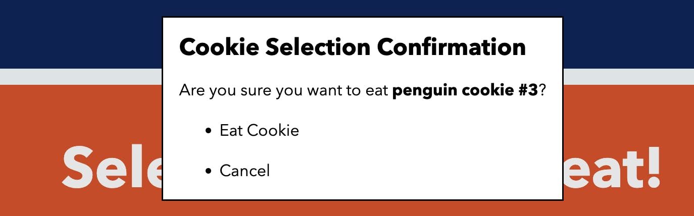
Because "Eat Cookie" is the first focusable element, by default, the browser will focus it when the dialog is opened. If you need to change the first-focused element, you can add the autofocus attribute.
Note that if you determine that the dialog itself or something like a headline or other non-interactive element should be focused, you'll need to add tabindex="0" to enable it as focusable. I recommend Adrian Roselli's article to learn more about dialog focus management.
Through testing with VoiceOver on Mac, the h3 title is also read out before announcing the focused button, which helps lend context to the action.
Closing the dialog
#We haven't yet added a script to indicate an element to close the button, but the Esc key is enabled for closing due to using the showModal() method (refer back to the "Modal vs. non-modal dialogs" section). This behavior is not available when using the show() method for non-modal dialogs.
Due to how we want our modal to work, we will enable closing of the dialog for both buttons as a starting point. The following enhances our previous dialog script.
document.addEventListener("click", ({ target }) => {
  // ... show logic

  // Close the dialog when either action button is clicked
  if (target.matches("[data-action]")) {
    dialog.close();
  }
});
Removing cookies
#There's one more behavior we want for our modal which is when the confirm button for "Eat cookie" is selected then we need to remove the selected cookie.
Upon closing a dialog, the browser will place focus back on the element that launched the dialog. We can take advantage of this behavior to remove that cookie. The browser tracks the currently focused element via document.activeElement.
document.addEventListener("click", ({ target }) => {
  // ... show logic
  // ... close logic

  if (target.matches('[data-action="confirm"]')) {
    // find cookie based on active focus
    const cookie = document.activeElement;
    // remove cookie from DOM
    cookie.remove();
  }
});
However, we also need to define a replacement element to give focus to.
In this case, we'll enable the .cookie-tray unordered list as a programmatically focusable element by adding tabindex="-1". We'll also update the headline to add an id attribute which we'll reference from the aria-labelledby attribute on the list. This will help re-orient screen reader users after the cookie disappears and the focus is moved.
<!-- Updates to the headline and `ul` -->
<h2 id="cookie-tray-title">Select a cookie to eat!</h2>
<ul role="list" class="cookie-tray" tabindex="-1" aria-labelledby="cookie-tray-title">
Then, update the script to add the focus to .cookie-tray:
const cookieTray = document.querySelector(".cookie-tray");

document.addEventListener("click", ({ target }) => {
  // ...

  if (target.matches('[data-action="confirm"]')) {
    // ...

    // Set focus to ul.cookie-tray
    cookieTray.focus();
  }
});
As a bonus of .cookie-tray being a list element, the announced number of list items will update to only include non-empty list items, therefore accurately reflecting the number of cookies visible on the tray!
Depending on your reason for removing DOM elements, you may need to alter this logic to instead move focus to the next, first, or last item in the list depending on the position of the removed element.
Fully working dialog
const dialog2 = document.getElementById("cookie-confirmation-2");
const cookieTray = document.querySelector("#dialog-demo-2 .cookie-tray");

document.getElementById('dialog-demo-2').addEventListener("click", ({ target }) => {
  if (target.matches(".cookie")) {
    dialog2.querySelector(".cookie-name").textContent = target.querySelector(
      "img"
    ).alt;
    dialog2.showModal();
  }

  if (target.matches("[data-action]")) {
    dialog2.close();
  }

  if (target.matches('[data-action="confirm"]')) {
    const cookie = document.activeElement;
    if (cookie.matches(".cookie")) {
      cookie.remove();
    } else {
      // Safari prior to 16.1 does not re-focus dialog triggering element
      const cookieName = dialog2.querySelector(".cookie-name").textContent;
      cookieTray.querySelectorAll(".cookie img").forEach((c) => {
        if (c.alt.includes(cookieName)) {
          c.closest(".cookie").remove();
        }
      });
    }
    cookieTray.focus();
  }
});
Select a cookie to eat!
Styling the dialog
#Our dialog still looks quite plain, so let's fix it up!
The following demo styles the buttons and content, but also adjusts the modal position with the following declarations which centers the dialog within the viewport. You may want to also explicitly add dimension styles depending on your dialog's content - be sure to test cross-browser!
dialog {
  margin: auto;
  position: fixed;
}
If needed, you can also specifically style open modal dialogs using the :modal pseudo class.
Additionally, there is a pseudo-element available when the dialog is open which can be styled with the ::backdrop selector. We'll darken it to a 35% opacity black and also use the property backdrop-filter to create a blurred effect of the content behind the modal.
::backdrop {
  background-color: hsl(0 0% 0% / 35%);
  backdrop-filter: blur(2px);
}
Final dialog with styles
#dialog-demo-3 dialog {
  margin: auto;
  padding: 0;
  width: min(40ch, 100vw - 2rem);
  position: fixed;
  border-radius: 0.5rem;
  font-size: 1.35rem;
  background-color: white;
  border: 2px solid;
}

#dialog-demo-3 .dialog-content {
  padding: clamp(1rem, 5%, 2rem);
}

#dialog-demo-3 ::backdrop {
  background-color: rgba(0, 0, 0, 0.35);
  backdrop-filter: blur(2px);
}

#dialog-demo-3 dialog .dialog-actions {
  list-style: none;
  padding: 0;
  margin: 1rem auto 0;
  display: flex;
  flex-wrap: wrap;
  justify-content: center;
  gap: 1rem;
}

#dialog-demo-3 dialog .dialog-actions button {
  padding: 0.5em 1em;
  border: 1px solid gray;
  border-radius: 0.25rem;
  cursor: pointer;
  text-align: center;
}

#dialog-demo-3 dialog .dialog-actions li {
  margin: 0;
}

#dialog-demo-3 [data-action=confirm] {
  --button-focus: hsl(80 70% 25%);
}

#dialog-demo-3 [data-action=confirm]:is(:focus, :hover) {
  background-color: #bbe467;
}

#dialog-demo-3 [data-action=cancel]:is(:focus, :hover) {
  background-color: #f4c7be;
}
const dialog3 = document.getElementById("cookie-confirmation-3");
const cookieTray3 = document.querySelector("#dialog-demo-3 .cookie-tray");
document.getElementById('dialog-demo-3').addEventListener("click", ({ target }) => {
if (target.matches(".cookie")) {
dialog3.querySelector(".cookie-name").textContent = target.querySelector(
"img"
).alt;
dialog3.showModal();
}
if (target.matches("[data-action]")) {
dialog3.close();
}
if (target.matches('[data-action="confirm"]')) {
const cookie = document.activeElement;
if (cookie.matches(".cookie")) {
cookie.remove();
} else {
// Safari prior to 16.1 does not re-focus dialog triggering element
const cookieName = dialog3.querySelector(".cookie-name").textContent;
cookieTray3.querySelectorAll(".cookie img").forEach((c) => {
if (c.alt.includes(cookieName)) {
c.closest(".cookie").remove();
}
});
}
cookieTray3.focus();
}
});
dialog3.addEventListener("click", ({ target }) => {
if(target.matches('dialog')) {
dialog3.close();
}
});Select a cookie to eat!
Closing on backdrop interaction
#In the final styled demo, we also included the ability for clicks on the backdrop to close the dialog by detecting clicks that land on the dialog element itself. The method demonstrated works only if there is a child element that wraps the visible dialog contents and covers their full dimensions, and the dialog takes up the remaining viewport space. Meaning, for example, if you add padding, ensure it's on the content wrapper instead of the dialog. Our child element is div.dialog-content, and the dialog covers the viewport due to the margin filling the space.
dialog.addEventListener("click", ({ target }) => {
  if(target.matches('dialog')) {
    dialog.close();
  }
});
Additional resources on dialogs
#While this demo covered the essentials for defining, opening, closing, and styling the <dialog> element, there is quite a bit more to consider (like, do you even need a dialog?).
- MDN documentation on dialog
- Further definition of and accessibility considerations for non-modal dialogs
- "An open dialog" from Scott O'Hara shares some history and remaining considerations for using
<dialog> - "In defense of dialog" by Sam Thorogood covers more use cases and features
- A thorough guide to "Creating An Accessible Dialog from Scratch" from Kitty Giraudel explaining all the considerations you'd have to address if you didn't use the dialog element
- Also from Kitty is the wonderful a11y-dialog script which may presently be more suited for your audience if they are not using the latest browsers
Stephanie selected The Trevor Project for an honorary donation of $50 which has been matched by 
The Trevor Project’s mission is to end suicide among LGBTQ young people.