
The subgrid value for grid-template-rows and grid-template-columns is now supported in Firefox and Safari 16+, and coming soon to Chrome. In this article, you’ll learn the ways that this feature makes grid layout even more powerful.
All of the examples in this article can be viewed with subgrid working in Firefox or Safari 16+, except for the final example.
It doesn’t add a whole lot more complexity
#Using subgrid means that instead of creating a track listing as a value for grid-template-columns and grid-template-rows, you use the keyword subgrid.
There are no new properties or values to learn, just a decision to make—do you want your nested grid to have its own row and/or column definition, or to use the one from the parent?
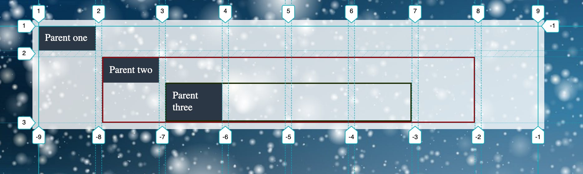
In the first example, I have a nested grid that is creating its own tracks for rows and columns. These tracks are independent, and so will not line up with the tracks on the parent grid.
The second example replaces the track listing for grid-template-columns with the keyword subgrid. The column tracks of the nested grid now line up with those on the parent.
You can have subgrids in your subgrids
#As long as each parent is a grid itself, you can keep inheriting subgrids down into children.
The following example shows three grids, each nested inside the other, and inheriting the tracks of their parent. The child items indicate which grid is their parent. Using Firefox DevTools to highlight each grid, highlighting the outer grid shows how the children grids and grid items all align to that grid.
You don’t need to have a subgrid in both dimensions
#When subgrid was discussed in the CSS Working Group, there was a suggestion that it should be locked to both rows and columns. This would have meant there was no implicit grid in either dimension, and subgrid would only be useful if you knew exactly how many grid cells you needed in the subgrid.
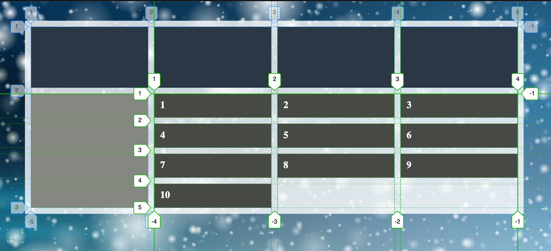
In the next example, I have created a subgrid on columns to ensure items in the nested grid can align with items directly inside the parent grid. However, I am using the implicit grid for rows, as I may have any number of items.
Subgrid can help with situations where you need to target the end line of the implicit grid
#The previous example demonstrates another useful pattern enabled by subgrid. It’s possible to target the end line of the explicit grid using line -1. Unfortunately, this doesn’t work to target the end line of an implicit grid.
By nesting repeating items in a container, they all go into one row on the parent. This means you can have the full height column shown in the previous example without needing to know how many lines of items are created implicitly.
If you inspect the previous example using DevTools, you can see how the subgridded items create implicit rows. As the item on the left is in the parent grid, it is in the same row as all of the items and therefore can become as tall as is needed to align with the implicit rows.
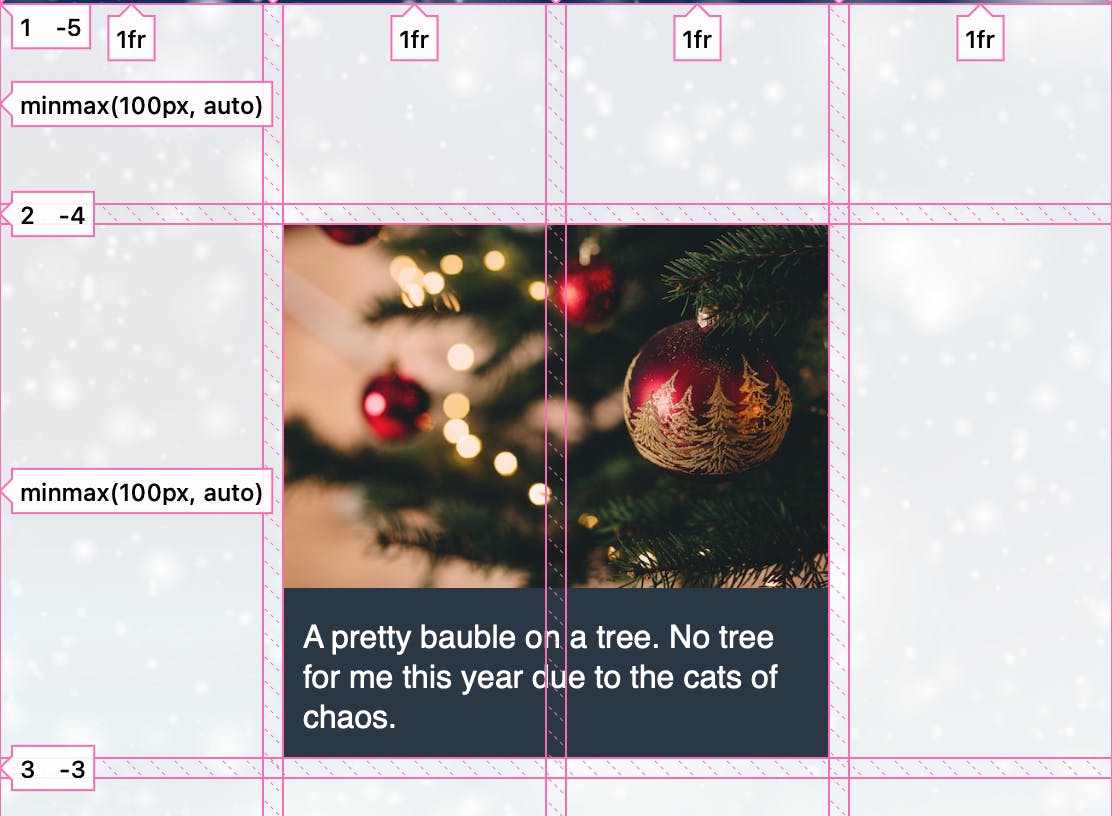
You can align things using the line names of the parent grid
#If your parent grid has named lines, these are accessible from the child. In the following example, lines on the parent grid are named a through e. The subgrid and a child of that subgrid are then placed using these named lines. This technique is useful, as it saves keeping track of what line number things are. You can set up names on the parent and know that by placing an item starting at that line it will always align with other things starting on that line.
You can add line names to the subgrid
#Can’t get enough line names? You can add names to the lines within the subgrid. Granted, the syntax is a bit unusual, because we don’t have a track listing to put the line names into. Instead, you add the names after the subgrid keyword.
.subgrid {
  display: grid;
  grid-template-columns: subgrid [line1] [line2] [line3];
}
These names will be added to any other names the line has, as a line can have multiple names. You can then reference it using any of the names assigned.
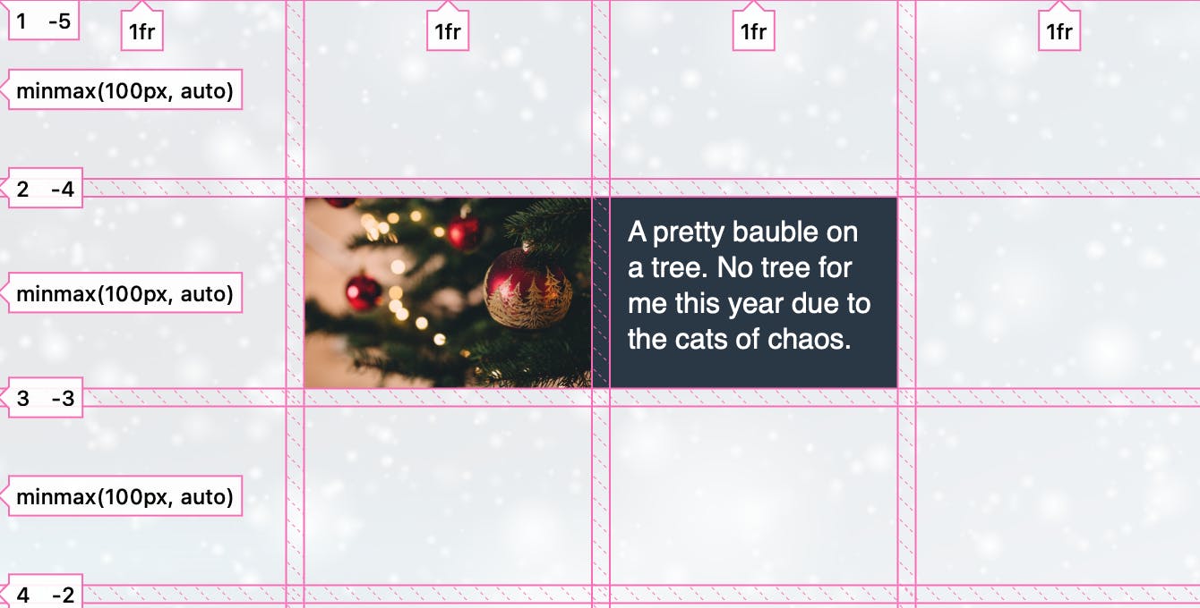
You can use implicitly named areas from inherited lines in your main grid and subgrid
#When you name lines with the suffix -start and -end, you get a named area of the main name used. As lines are inherited so are these named areas. In the following example, I have named lines main-start and main-end and col-start and col-end. This gives me a wide column named main, and a narrow column named col.
I place the article into grid-column: main, and then make it a subgrid. I can then place the contents of the article into the narrow column with grid-column: col.
The subgrid can have different-sized gaps to its parent
#The gap property will inherit into the subgrid so, by default, a subgridded element will have the same size gaps as its parent. If you don’t want that, use the gap property (or column-gap or row-gap) to change it.
In the following example, the parent grid has 20px gaps for rows and columns. In the subgrid, I want just 1 pixel of the background to show through as a gap, so I have changed the gap on the subgridded card to 1px.
You can line up items that are in different subgrids
#Using subgrid for rows means that items nested in separate subgrids, such as the cards in the previous example, are in the same row meaning items inside can align with each other. If I add more content to one of the headings, you can see how all headings in that row get extra space below and remain aligned.
Subgrid can be usefully combined with container queries
#A common pattern is to have a 12-column grid at all breakpoints, and as the viewport becomes smaller, items span more of the columns. At a very narrow viewport width an item might span all 12, on the desktop 3.
Using container queries, you can test to see if the container has enough space, then switch on subgrid so the component can use the tracks it spans across. In the following example, the card spans two column tracks of the parent grid. At narrow widths, the card is not a subgrid, and the image and content display one after the other.
Once there is enough room, the card becomes a subgrid and the image and content display side by side.
Additional resources on subgrid
#With subgrid coming to all engines very soon, it’s a great time to start to play with it and see what other reasons to love subgrid you can come up with. See the following resources for more ideas and help.
- Subgrid on MDN
- CSS Grid Level 2: Here comes subgrid
- Hello Subgrid! (video)
- Subgrid examples on Grid by Example
Rachel selected Holly Hedge for an honorary donation of $50 which has been matched by 

Holly Hedge is an organization in Rachel's home town of Bristol. They rescue and rehome unwanted and often poorly treated animals, and do an amazing job finding homes for over 800 animals a year.