
Howdy! Ben here.
This month, deep in the throes of shopping for last-minute gifts online, I've encountered a lot of forms. The thing about forms is they can get repetitive fast. Name, email, phone number, address, billing details… It might be Christmastime, but it's feeling more like Groundhog's Day!
To that end, let's talk about some handy web form APIs that can make forms much more comfortable to fill out: autocomplete and virtual keyboard options.
Autocomplete
#This holiday season, give your users the gift of not having to fill out forms themselves! With the <input> element's autocomplete attribute, we can tell our user's browsers which common bits of form data we're expecting, and the browser will give users the chance to populate those fields instantly using values from their previous submissions.
This is commonly used to fill out contact info, such as:
<form>
  <label for="name">Name:</label>
  <input type="text"
    id="name"
    autocomplete="name" />
</form>
If we need, we could get individual piece of our user's name with autocomplete="honorific-prefix", "given-name", "additional-name", "family-name", "honorific-suffix", and "nickname" (but beware of misconceptions about how names work):
<form>
  <label for="prefix">
    Honorific Prefix (for example, Ms., Mx., Dr.):
  </label>
  <input type="text"
    id="prefix"
    autocomplete="honorific-prefix" />

  <label for="firstName">
    First Name:
  </label>
  <input type="text"
    id="firstName"
    autocomplete="given-name" />

  <label for="middleName">
    Middle Name:
  </label>
  <input type="text"
    id="middleName"
    autocomplete="additional-name" />

  <label for="lastName">
    Last Name:
  </label>
  <input type="text"
    id="lastName"
    autocomplete="family-name" />

  <label for="suffix">
    Suffix (for example, Jr., III, PhD):
  </label>
  <input type="text"
    id="suffix"
    autocomplete="honorific-suffix" />

  <label for="nickname">
    Nickname:
  </label>
  <input type="text"
    id="nickname"
    autocomplete="nickname" />
</form>
We can help the user autofill their address:
<form>
  <label for="name">
    Name:
  </label>
  <input type="text"
    id="name"
    autocomplete="name" />

  <label for="addressLine1">
    Address Line 1:
  </label>
  <input type="text"
    id="addressLine1"
    autocomplete="address-line1" />

  <label for="addressLine2">
    Address Line 2:
  </label>
  <input type="text"
    id="addressLine2"
    autocomplete="address-line2" />

  <label for="city">
    City:
  </label>
  <input type="text"
    id="city"
    autocomplete="address-level2" />

  <label for="state">
    State:
  </label>
  <input type="text"
    id="state"
    autocomplete="address-level1" />

  <label for="zip">
    Postal Code/ZIP Code:
  </label>
  <input type="text"
    id="zip"
    autocomplete="postal-code" />

  <label for="country">
    Country:
  </label>
  <input type="text"
    id="country"
    autocomplete="country-name" />
</form>
… Or their billing information!
<form>
  <label for="name">
    Cardholder Name:
  </label>
  <input type="text"
    id="name"
    autocomplete="cc-name" />

  <label for="cardNumber">
    Card Number:
  </label>
  <input type="text"
    id="cardNumber"
    autocomplete="cc-number" />

  <label for="cardExpiryMonth">
    Expiration Month:
  </label>
  <input type="text"
    id="cardExpiryMonth"
    autocomplete="cc-exp-month" />

  <label for="cardExpiryYear">
    Expiration Year:
  </label>
  <input type="text"
    id="cardExpiryYear"
    autocomplete="cc-exp-year" />

  <label for="cardSecurityCode">
    Card Security Code:
  </label>
  <input type="text"
    id="cardSecurityCode"
    autocomplete="cc-csc" />
</form>
autocomplete has so many options to give your users a boost when they're filling out forms on your site. You can autofill their birthdays (with "bday" — or "bday-day", "bday-month", and "bday-year"), their phone numbers ("tel"), their username ("username"), and more! It's worth going to MDN to see them all!
Autocomplete for One-Time Codes
#While I'm just listing out possible autocomplete values, I'm gonna pause here to geek out about one option I've found especially convenient: autocomplete="one-time-code". This particular value is supported by iOS and Android, and it's meant for when a user is trying to sign in to your site from their phone and they receive a text message with a six-digit one-time code to log in. The user's mobile browser can get that six-digit code from their text messages and fill out the field automatically, so that the user doesn't have to switch between their browser and their texts. See `"one-time-code" in action here!
The web is really cool, sometimes.
Autocomplete and Accessibility
#Autocomplete aids accessibility! For instance, for people with motor disabilities and chronic illnesses, who might find filling out large forms difficult or painful, autocomplete can really save time and spoons. It's also less taxing for people with memory issues or anyone whose disabilities make it difficult to read or write.
In fact, using autocomplete values when available is required for meeting WCAG Success Criterion 1.3.5 - Identify Input Purpose. This criterion specifically states that an input's purpose can be "programmatically determined" which is exactly what autocomplete helps do. The criterion also notes that a proper label helps in this goal, for example in clarifying what type of email is required, such as business or personal or someone else's.
Virtual Keyboard Modes
#In addition to autocomplete="one-time-code", mentioned above, we devs have more ways to show love to forms in mobile browsers. Specifically, we can give the user's mobile browsers hints as to tweak the on-screen virtual keyboard interface that pops up.
The primary way we tweak this is through the <input>'s type: <input type="text" /> shows the user's normal keyboard, <input type="email"> shows an adjusted keyboard which displays the @ key more prominently, <input type="number"> shows a numeric keyboard, and so forth. Adding the type attribute also hints to the browser that it should apply a bit of validation to those fields before submitting the form.
Thanks to the <input> element's inputmode and enterkeyhint attributes, we can tweak the virtual keyboards further:
inputmode
#inputmode can be used to change the virtual keyboard's layout. It typically highlights certain keys for certain kinds of content like type does, but it doesn't enable field validation like type will. Your inputmode options are:
text- the default keyboardsearch- for search queriesemail- for email addressesurl- for URLsnumeric- for numbers without decimal pointsdecimal- for numbers with decimal pointstel- for phone numbers
Here's a look at the difference between "numeric" and "decimal" on my iPhone.
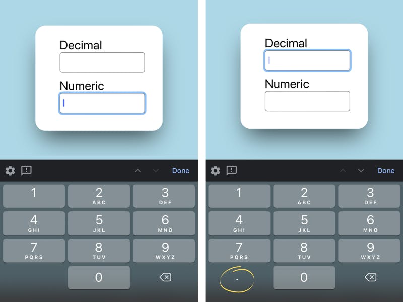
The difference is pretty subtle — the decimal example shows a decimal point key in the bottom-left corner of the keypad. It's a little thing, but it can help guide users into supplying the right information.
enterkeyhint
#Finally, we're able to tweak the message that shows up in the mobile user's virtual Enter key, thanks to the enterkeyhint attribute, which can be one of the following:
doneentergonextprevioussearchsend
Here are a few examples of that in action:
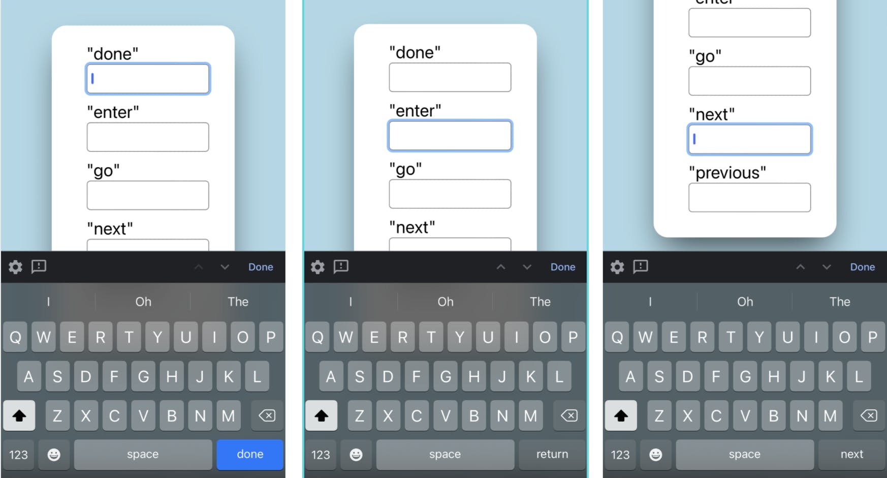
Why should we worry about tweaking a single key on our user's virtual keyboard display? Submitting a form, especially a critical, sensitive form, can be nerve-wracking, and our users might be nervous about clicking the wrong button at the wrong time and submitting their form prematurely. By changing the enterkeyhint, we can clue them in to what will happen when they click the button, so they know what's safe or not.
Contact Form demo
#The following demo comes from HtmlRecipes.dev with one tweak to not make the button submit the form strictly for demonstration so you can safely test the autocomplete values for the name and email.
Contact form using autocomplete
.demo {
  background-color: lightblue;
  display: grid;
  place-content: center;
}

.contact-form {
  /* demo reset from site styles */
  all: unset;
  max-width: 40ch;
  margin: auto;
  background-color: white;
  padding: 1rem 2rem;
  border-radius: 20px;
  box-shadow: 0 0 #0000, 0 0 #0000, 0 25px 50px -12px rgba(0, 0, 0, 0.65);
}

.contact-form label {
  display: block;
}

.contact-form input {
  width: 100%;
  height: 3em;
  margin-bottom: 1em;
}

.contact-form textarea {
  width: 100%;
}Bonus tip: Styling form fields
#Steph has covered styling form fields over on her series on ModernCSS.dev: