
Updated September 2022
CSS Container Queries are an upcoming way to move beyond media queries that are tied to the viewport and instead will enable us to modify an element's behavior based on the container it's within. This has been a requested feature for many years, with developers desiring to change an element based on its own width. However, the in-progress spec will allow querying for other property values - including from custom properties - to alter a component.
Back in May, I wrote "A Primer on CSS Container Queries" and since that time the spec has moved into being a Public Working Draft and some of the syntax has been updated.
Enabling container queries
#If you would like to view the demos in this article and experiment with container queries yourself, you'll need to be on a supporting browser:
- All nightly versions
- Chromium 105+
- Safari 16+
Defining containment
#Given that the container query spec is not final, keep in mind that the syntax discussed in this post is at risk of changing.
A key concept of container queries is that you must explicitly define which elements allow containment. Then you query against those containers which allow you to affect the properties of its children. This can be a bit of a gotcha, which we'll look at in action a bit later.
At minimum for queries intended to be based on width, containment is defined by setting container-type: inline-size on a containing element.
main {
  container-type: inline-size;
}
Optionally, you can also name your container with container-name which is useful if you have several layers of containment so that you can be more explicit about which queries affect elements.
Both type and name can be defined using the shorthand container property, where the name is first and separated from the type by a forward slash.
main {
  container: main / inline-size;
}
If a container query is applied to an element that has no defined containing ancestor, the query will fail to apply. In other words - there is no default fallback containment on either the body or html elements.
Defining a container query
#Now that we know how to apply containment to an element, we're ready to actually write a container query!
Eventually, we'll be able to not just query based on size but also style properties (at time of writing, querying on style was not yet supported).
With our current container-type using inline-size, we'll write our first query. We'll also explicitly query against our named container of "main". If we left off the name, this query would be against the h2's nearest ancestor with containment.
@container main (width >= 40ch) {
  h2 {
    color: blue;
  }
}
Oh, and what's that? A new syntax for the query definition using math comparisons? Oh yes! This is an update that will be coming to "old fashioned" media queries against the viewport as well! Thanks, CSS Working group 🥰
Demo of responding to size containment
#Let's put the pieces we've learned so far together. For myself, so far treating container queries similar to the idea of "mobile first" has made the most sense in developing my "breakpoints" across component states. By which I mean styling for the narrowest view as the default then handling updates for larger widths via the container queries.
We'll be using CSS grid and grid areas to adjust a card layout, and particularly to update the card image location and aspect ratio.
Narrow container card styles
#For the narrowest expected container, our card elements simply stack and the image is set at aspect-ratio: 4/3.
Our initial HTML is very simple:
<div class="card">
  <img src="https://source.unsplash.com/V7SKRhXskv8/400x300" alt="">
  <h3>Container Queries Rule</h3>
  <p>Lorem ipsum dolor, sit amet consectetur adipisicing elit. Quis magni eveniet natus nulla distinctio eaque?</p>
</div>
Demo of narrowest card styles
.card {
  display: grid;
  gap: 1rem;
  margin: 5vh auto;
  padding: 1rem;
  border-radius: 0.5rem;
  box-shadow: 0 .25rem 0.5rem -.15rem hsla(0 0% 0% / 55%);
}

.card > * {
  margin: 0;
}

.card img {
  max-width: 100%;
  aspect-ratio: 4/3;
  object-fit: cover;
  border-radius: inherit;
}
Container Queries Rule
Lorem ipsum dolor, sit amet consectetur adipisicing elit. Quis magni eveniet natus nulla distinctio eaque?
This may look a little strange if you are viewing this on a larger viewport because the card currently has no width constraints.
I mentioned we'd be updating the card layout using CSS grid template areas, and we want those to apply based on container queries. Let's see what happens if we add containment to the card class, and then add a container query to define the grid template areas.
Demo of applying containment to .card
.card--contained {
  container-type: inline-size;
}

@container (width >= 30ch) {
  .card--contained {
    grid-template-areas: "image title" "content content";
  }
}
Container Queries Rule
Lorem ipsum dolor, sit amet consectetur adipisicing elit. Quis magni eveniet natus nulla distinctio eaque?
If you're in a browser with container query enabled, you might be surprised that no change has occurred... unless you remember the "gotcha" I noted earlier.
Since an element can't change its properties within a container query unless it has an ancestor with containment, our attempt at updating the display of the card was unsuccessful.
In this case, we need to add a wrapping element to provide containment. Let's make that adjustment to our HTML and then adjust the styles. Note that the demo styles require a bit of extra scoping to be able to show the change from the previous state.
<div class="card-container">
  <div class="card">
    <img src="https://source.unsplash.com/V7SKRhXskv8/400x300" alt="">
    <h3>Container Queries Rule</h3>
    <p>Lorem ipsum dolor, sit amet consectetur adipisicing elit. Quis magni eveniet natus nulla distinctio eaque?</p>
  </div>
</div>
Demo of adding a wrapping element with containment
.card-container {
  container-type: inline-size;
  margin: 0;
}

@container (width >= 30ch) {
  .card-container .card {
    grid-template-areas: "image title" "content content";
    grid-auto-columns: 33% 1fr;
    align-items: center;
  }

  .card-container .card p {
    grid-area: content;
  }

  .card-container .card img {
    aspect-ratio: 1;
  }
}
Container Queries Rule
Lorem ipsum dolor, sit amet consectetur adipisicing elit. Quis magni eveniet natus nulla distinctio eaque?
Hooray, our query was successfully applied!
You can probably assess that we can improve the layout here even more for larger widths, so let's do that. We'll adjust the template areas so the image takes up the left third and the title and content share the remaining inline space. There is no change needed for our HTML.
Demo of the "large" card container query
@container (width >= 60ch) {
  .card-container--large .card {
    grid-template-areas: "img title" "img content";
  }

  .card-container--large .card img {
    grid-area: img;
  }

  .card-container--large .card h3 {
    align-self: end;
  }

  .card-container--large .card p {
    align-self: start;
  }
}
Container Queries Rule
Lorem ipsum dolor, sit amet consectetur adipisicing elit. Quis magni eveniet natus nulla distinctio eaque?
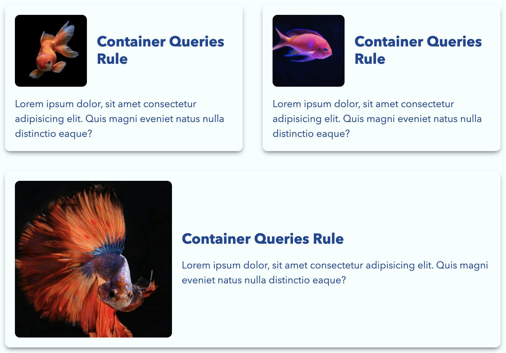
Multi-card layout
#Now, as a standalone card the variations still aren't too impressive, and you may be thinking the container query hasn't added much value.
Let's add a few more cards and place them within a flexbox-based grid layout.
Demo of cards within a flexible grid layout
.card-grid {
  display: flex;
  flex-wrap: wrap;
  gap: 2rem;
  list-style: none;
  padding: 0;
  margin: 0;
}

.card-grid .card-container {
  flex: 1 1 30ch;
}

.card-grid .card {
  margin: 0;
}-
Container Queries Rule
Lorem ipsum dolor, sit amet consectetur adipisicing elit. Quis magni eveniet natus nulla distinctio eaque?
-
Container Queries Rule
Lorem ipsum dolor, sit amet consectetur adipisicing elit. Quis magni eveniet natus nulla distinctio eaque?
-
Container Queries Rule
Lorem ipsum dolor, sit amet consectetur adipisicing elit. Quis magni eveniet natus nulla distinctio eaque?


If you are unable to use a supporting browser on your device, here's a preview of what these cards look like within the grid. Because of how we've setup our flexbox behavior, when there is enough room the third card can expand fullwidth. So in this preview we see the first and second card have taken on our medium container size and the third has taken on the large container size.
Container query units
#Along with the main spec is the inclusion of a new set of units related to the container size.
To me, one of the most exciting applications for these is responsive typography. Today, we can create what's often called fluid typography using the CSS function clamp() and viewport units. But those are not contextually ideal for smaller components like the cards we created since they are tied to the viewport.
We can take our cards one step further by applying the relevant container query unit as a swap for what we previously used a viewport unit for to make our card typography responsive.
We're still using clamp() to provide a range of acceptable values, and the container unit we've selected is cqi which represents increments of 1% of the container's inline size.
Demo of using container units for responsive typography
.card-container--units .card h3 {
  font-size: clamp(1.25rem, 3cqi + 1rem, 2.5rem);
}

.card-container--units .card p {
  font-size: clamp(.9rem, .5cqi + 1rem, 1.5rem);
}-
Container Queries Rule
Lorem ipsum dolor, sit amet consectetur adipisicing elit. Quis magni eveniet natus nulla distinctio eaque?
-
Container Queries Rule
Lorem ipsum dolor, sit amet consectetur adipisicing elit. Quis magni eveniet natus nulla distinctio eaque?
-
Container Queries Rule
Lorem ipsum dolor, sit amet consectetur adipisicing elit. Quis magni eveniet natus nulla distinctio eaque?
Additional resources on CSS container queries
#I hope this overview has sparked your interest in container queries! It's definitely the CSS feature I'm most hopeful will make it into more browsers in 2022.
If you'd like more of a background on what problem container queries are trying to solve and some additional considerations, be sure to read my original primer.
The primary spec author for container queries is Miriam Suzanne, and I highly recommend watching one of her presentations that covers not just CQ but also the other specs she's working on that are very exciting: layers and scope. I also encourage you to read her additional explainer doc.
There is already a page on MDN.
More examples of ways to use container queries (note that not all may have the updated syntax):
- Miriam's collection of CodePens
- Ahmad Shadeed's overview with practical applications
- And even more links to checkout in Stu Robson's repo Awesome-Container-Queries